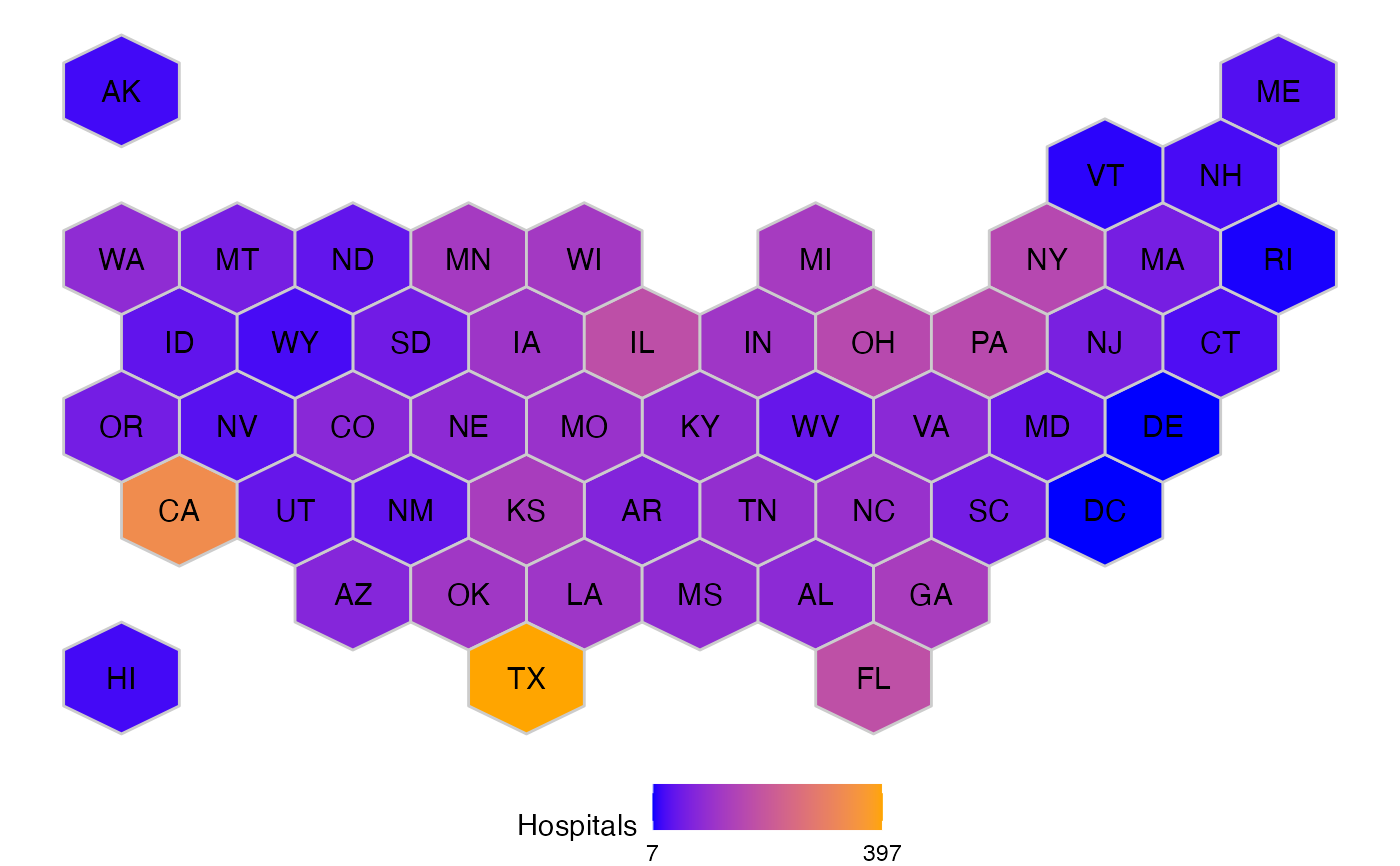
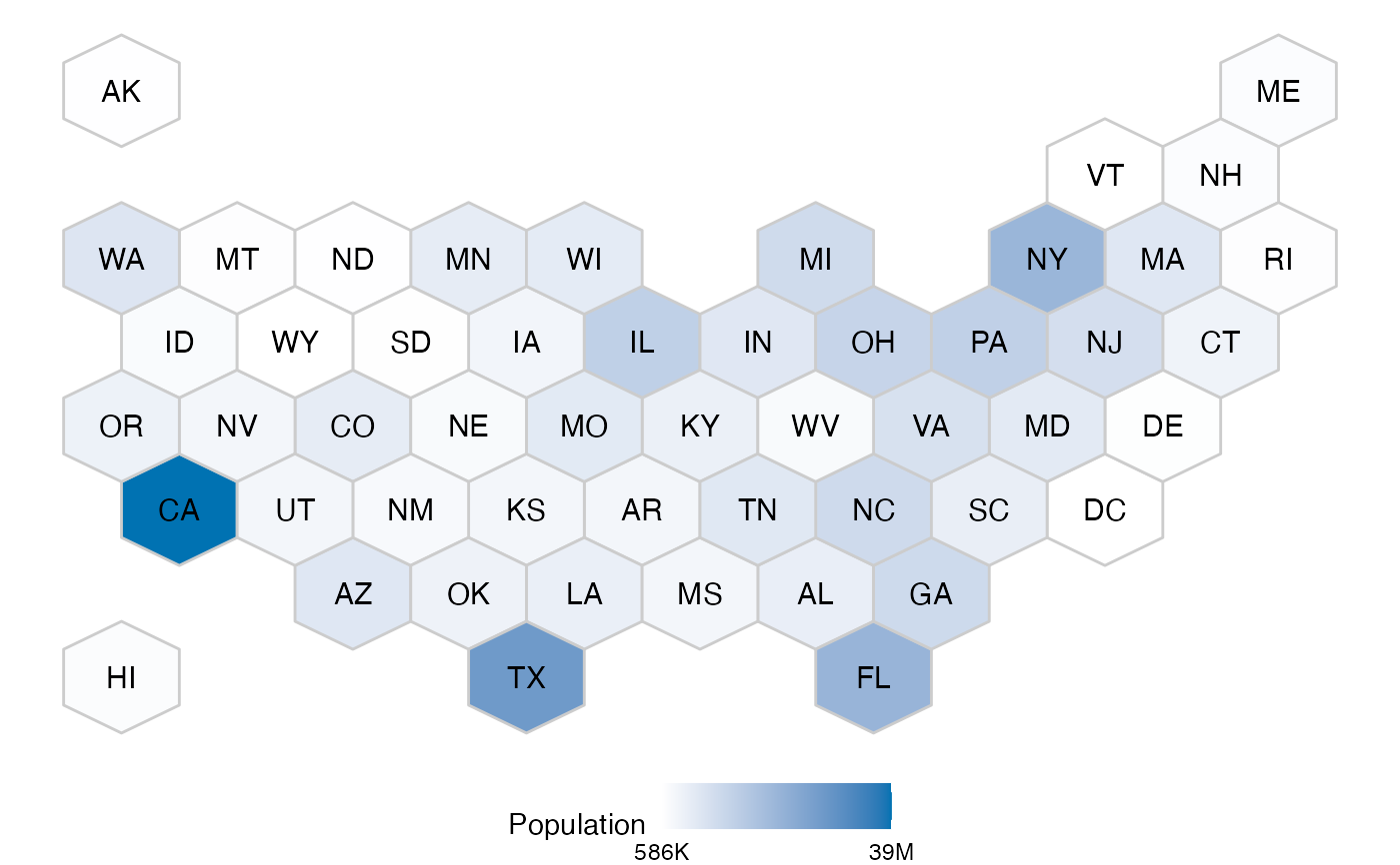
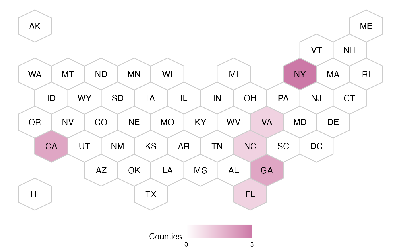
Creates a hex plot of all the states. It positions them in a relatively close location where they would be in a map. All of the states have the same size Hex, this makes them easy to find and compare to others.
Arguments
- variable
The variable to use as the driver for the color or level of transparency that will be displayed. There are four options: population of the state, the number of hospitals in that state, highlight states with counties above or below the model's predictions. The values that can be used are: population, hospitals, above or below. The default is population.
- colors
A list of two colors. One for the value of the high number and the other for the low number.
Examples
library(accesstocare)

atc_plot_us_map()


atc_plot_us_map("below")


atc_plot_us_map(
  "hospitals",
  colors = list(high = "orange", low = "blue")
)
atc_plot_us_map(
"hospitals",
colors = list(high = "orange", low = "blue")
)