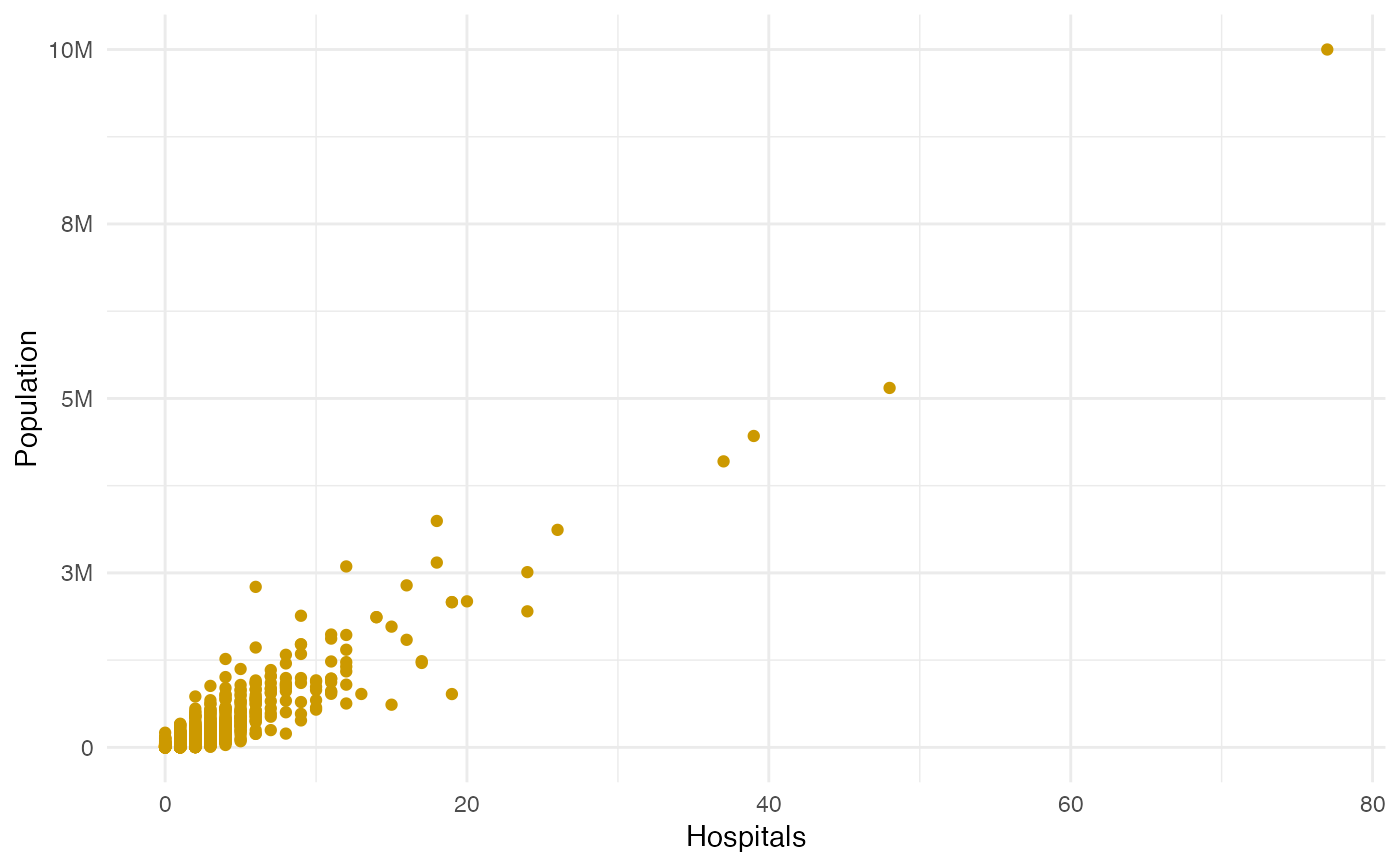
Returns a scatter plot comparing Hospital vs Population counts for all counties
Usage
atc_plot_hospitals(
  population_max = 1.1e+07,
  model_colors = list(above = palette_atc$above, below = palette_atc$below, ok =
    palette_atc$ok),
  show_model_results = FALSE
)
Arguments
- population_max
Top end limit for population count to display in the plot. Defaults to 11 million.
- model_colors
A list of 3 colors to use for counties below, above or at the level of expected hospitals as per the model.
- show_model_results
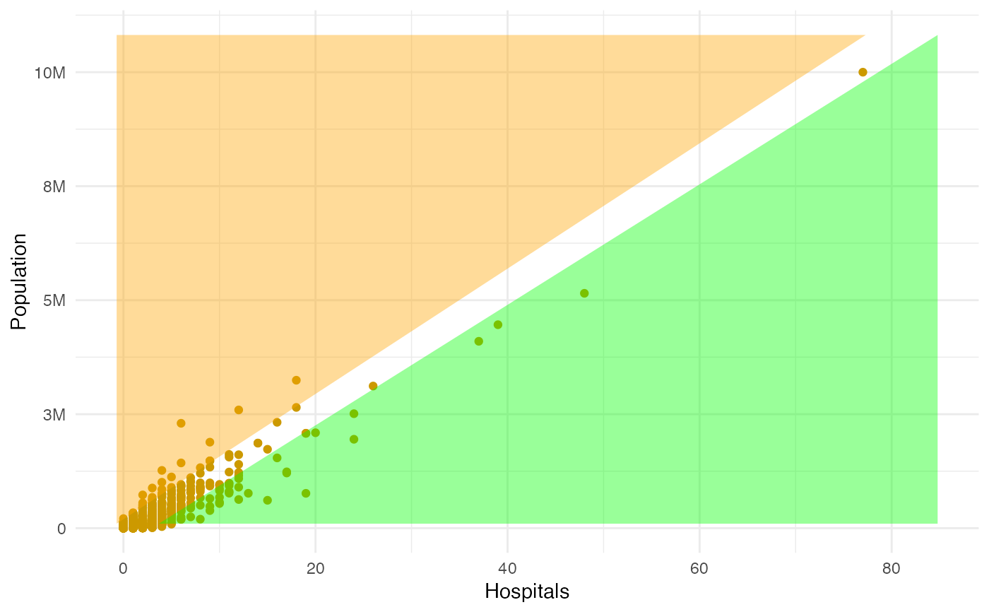
To highlight which counties are above or below the expected number of hospitals
Examples
library(accesstocare)
atc_plot_hospitals()
 atc_plot_hospitals(show_model_results = TRUE)
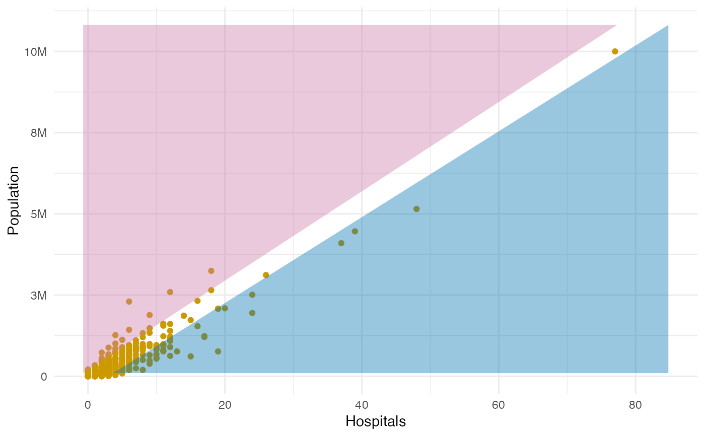 atc_plot_hospitals(
show_model_results = TRUE,
model_colors = list(above = "green", below = "orange")
)
atc_plot_hospitals(
show_model_results = TRUE,
model_colors = list(above = "green", below = "orange")
)